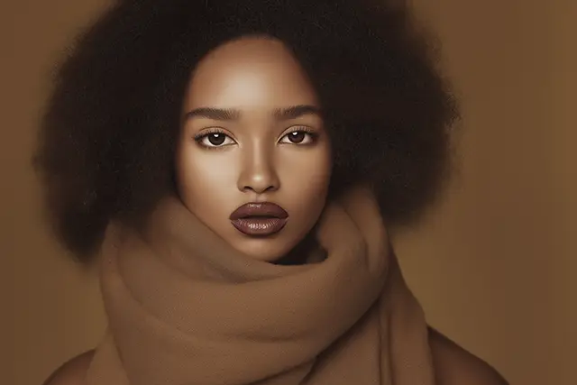
Be on the lookout for Mocha Mousse
By David Strand

Trendspotting: Watch how "Mocha Mousse" seeps into your everyday 'feed'
One of the most exciting aspects of creative work—whether it’s in design, branding, or marketing—is trendspotting. It’s a bit like detective work, sifting through what’s new and notable to uncover the threads that tie seemingly unrelated projects together. Fonts, colors, copy styles, logos, even the same actor popping up in multiple commercials (seriously, is it just me?)—all of these provide clues to what’s influencing the cultural zeitgeist.
Of all the trends you can spot, color is often the easiest and most fun to track. Why? Because it’s everywhere, from fashion and home goods to digital ads and tech product design. And right now, one color is poised to dominate our visual world in 2025: Pantone’s Color of the Year, “Mocha Mousse” (PANTONE 17-1230).
What’s the Deal with “Mocha Mousse”?
Imagine a rich, velvety brown with warm undertones. It’s sophisticated yet inviting, neutral but not boring. Pantone describes it as “a versatile and grounding shade that bridges the natural and digital worlds.” It's earthy enough for rustic interiors but polished enough for high-end packaging or luxury tech branding.
"Mocha Mousse" is the kind of color that sneaks up on you. You may not think you’ve seen it yet, but once you start paying attention, you’ll realize it’s been hiding in plain sight—on everything from coffee shop walls to the latest sneaker drops. The magic of a Pantone Color of the Year is how it influences trends across industries, creating a ripple effect that’s impossible to ignore.
The Trendspotting Challenge
Here’s where the fun begins: now that you know about "Mocha Mousse," start looking for it.
- Fashion: Watch how brands incorporate this warm brown into their seasonal collections. (Hint: It’s likely paired with soft creams or pops of vibrant blue for contrast.)
- Tech: Check out high-end electronics and see if this grounding neutral shows up in product packaging, promotional materials, or even UI designs.
- Home Decor: Expect to see “Mocha Mousse” gracing everything from cozy throw blankets to sleek ceramic dinnerware.
- Advertising: Keep an eye on big-name campaigns. You might notice subtle (or not-so-subtle) uses of this hue in everything from backgrounds to text overlays.
Why Play the Trendspotting Game?
Aside from being an enjoyable way to sharpen your creative instincts, trendspotting has practical value. For designers, marketers, and business owners, spotting trends early can help you stay ahead of the curve. Understanding why a particular color, style, or aesthetic resonates right now gives you insight into broader cultural moods and consumer behavior.
For example, "Mocha Mousse" speaks to a collective desire for comfort, grounding, and connection in an increasingly chaotic world. That’s a powerful insight for anyone trying to create meaningful and effective designs.
Ready to Start Spotting?
To help you get started, Pantone offers ideas on how to incorporate “Mocha Mousse” into various products and designs. Check out their guide here for inspiration.
And the next time you see a warm, chocolatey brown pop up on your Instagram feed or in a sleek tech ad, you’ll know exactly where the creative team got their inspiration. The best part? You’re not just a passive observer—you’re in on the game.
What trends will you spot next?
Play along on my LinkedIn post >>


